Predalina
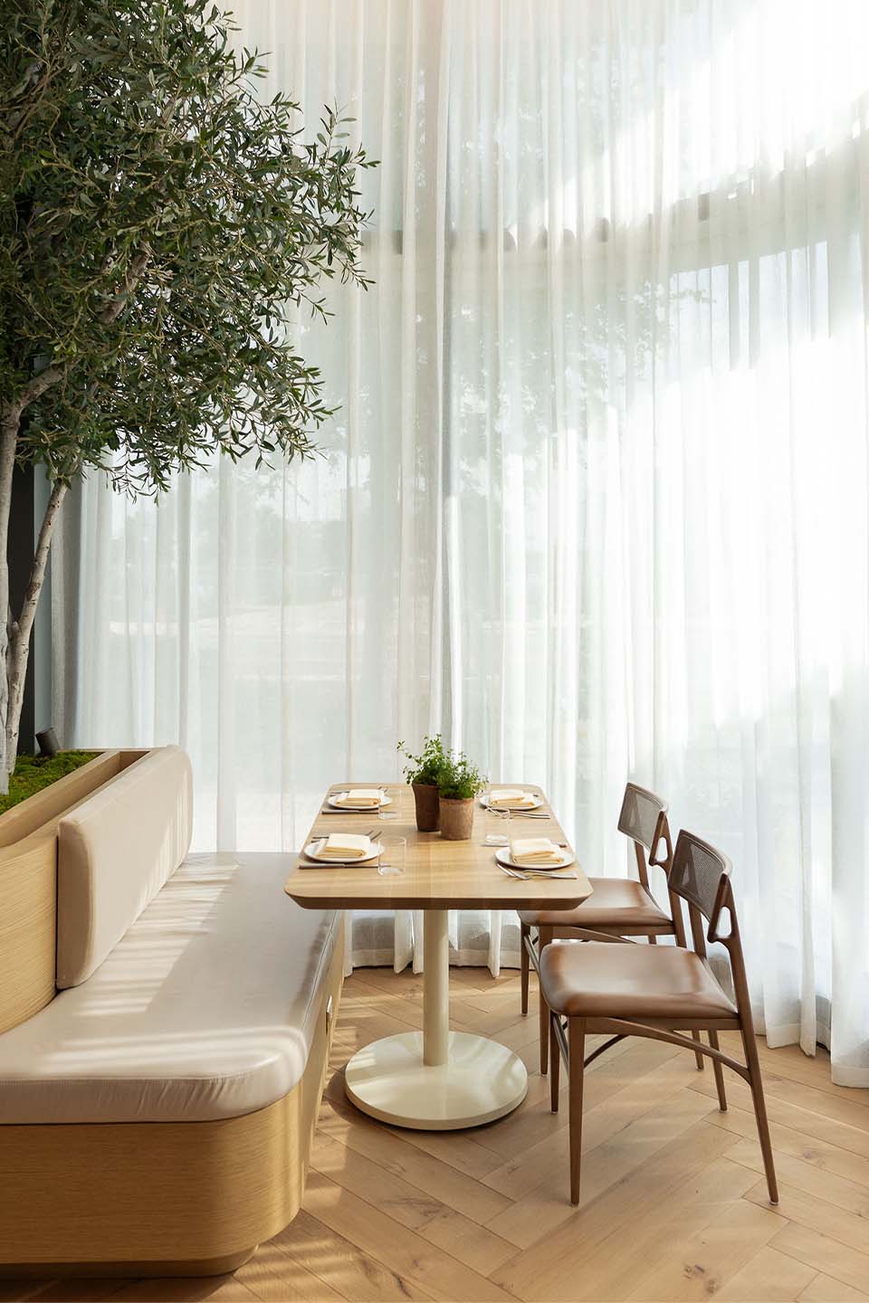
A modern Mediterranean restaurant celebrating the harmony between land and sea through thoughtful design and elevated dining.
Discipline
Tools
Contributors
Project Details
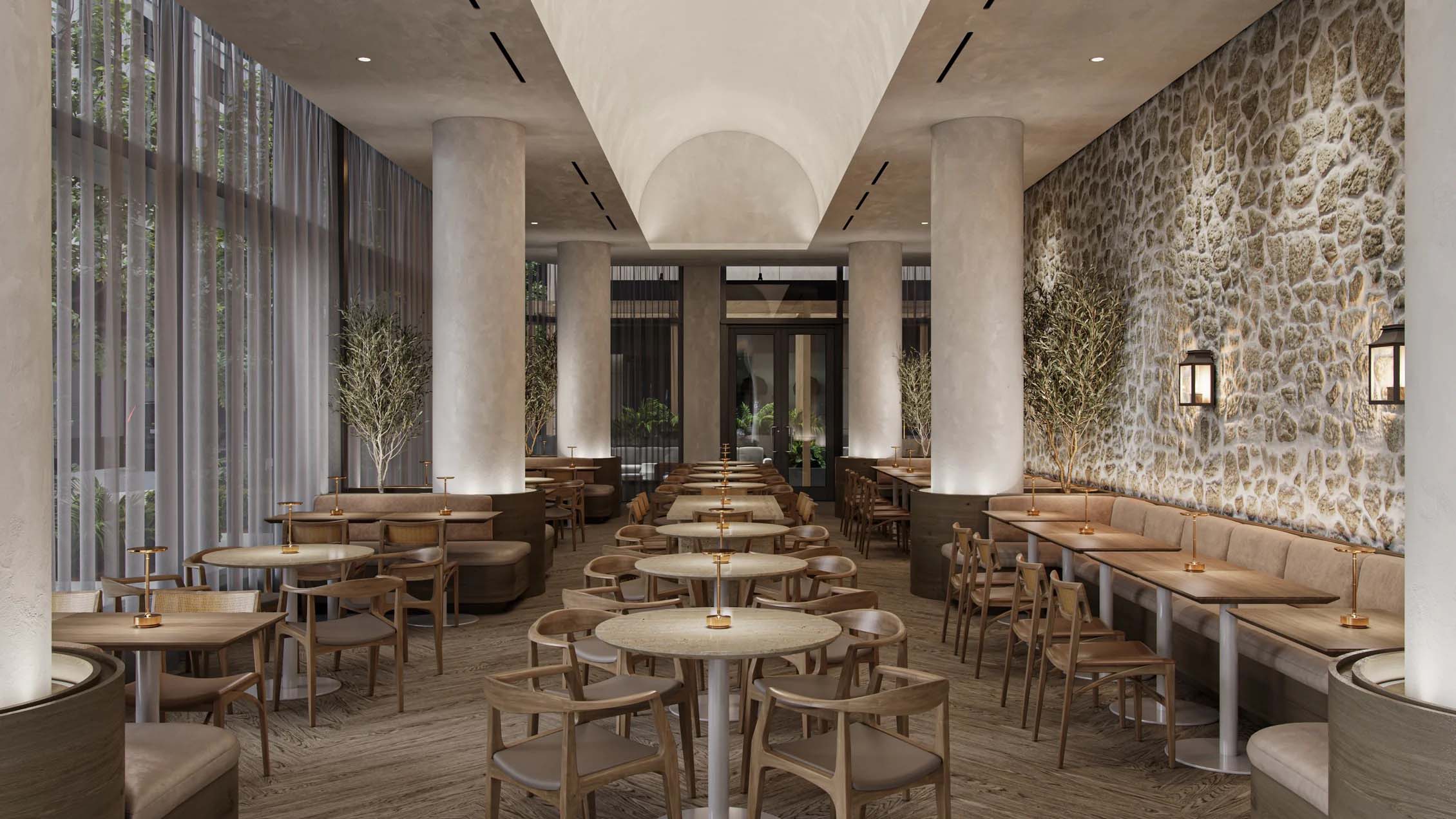
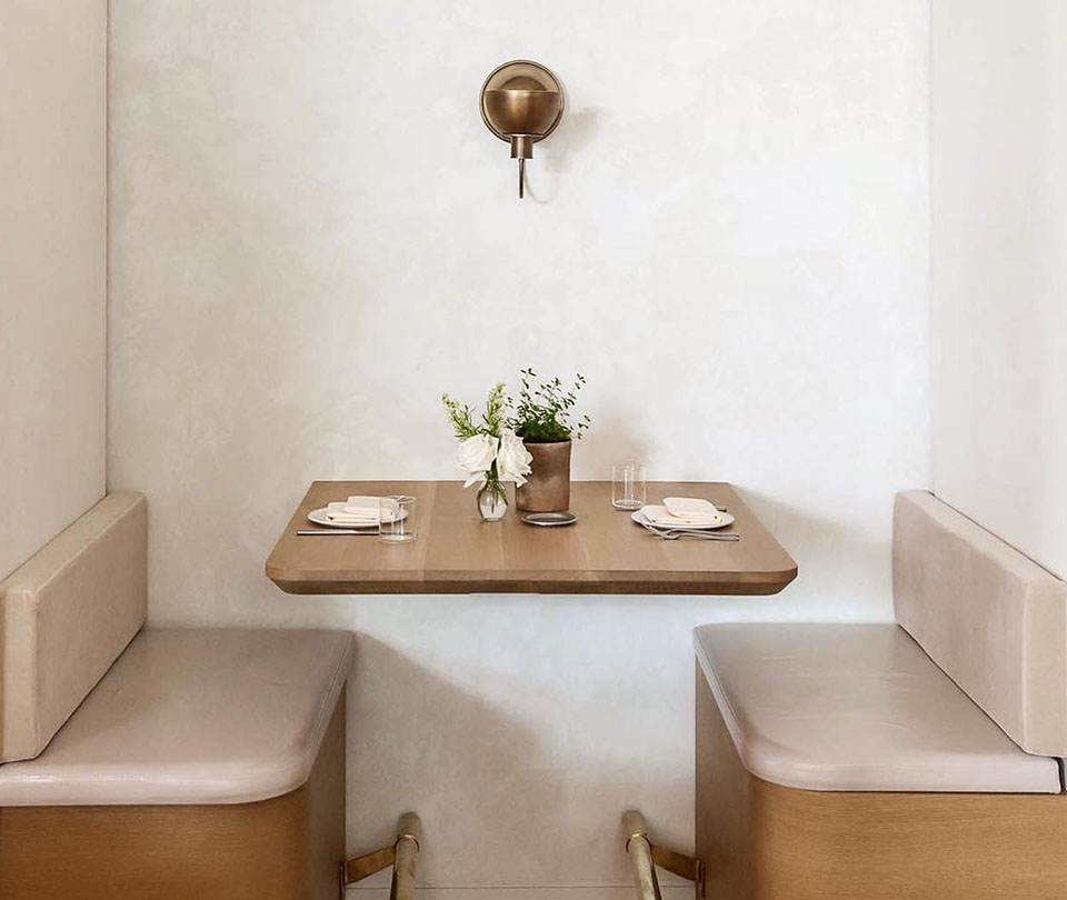
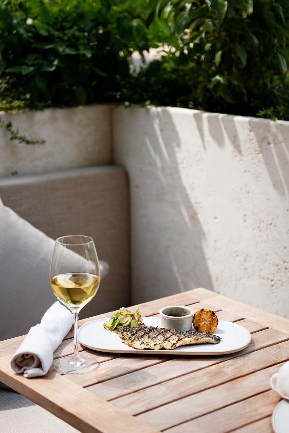
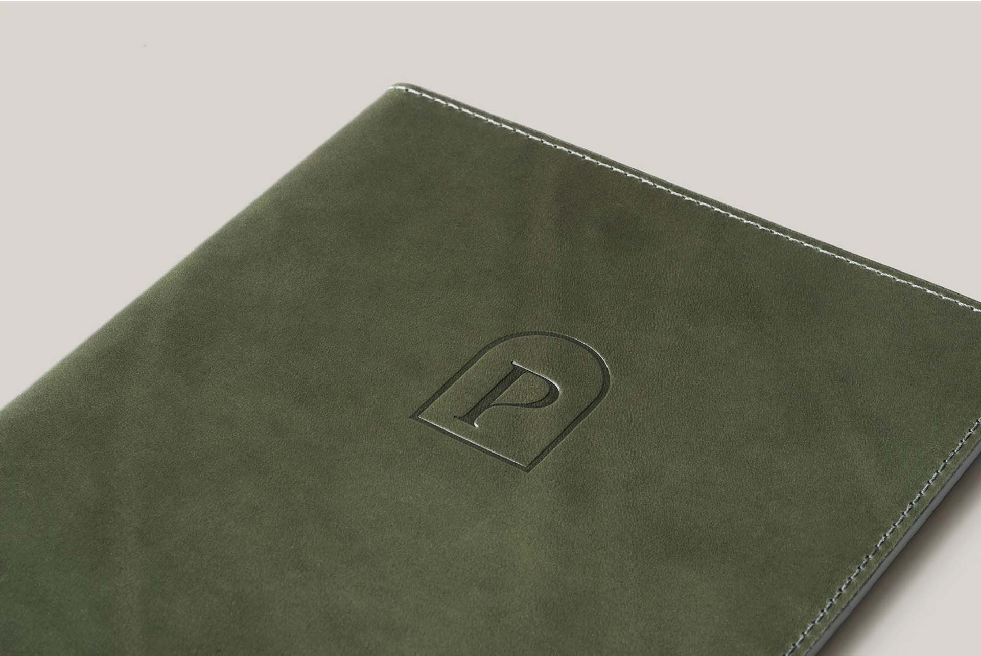
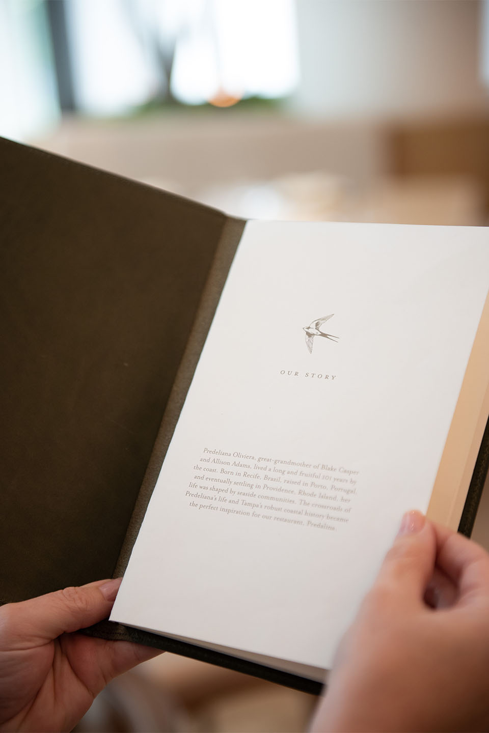
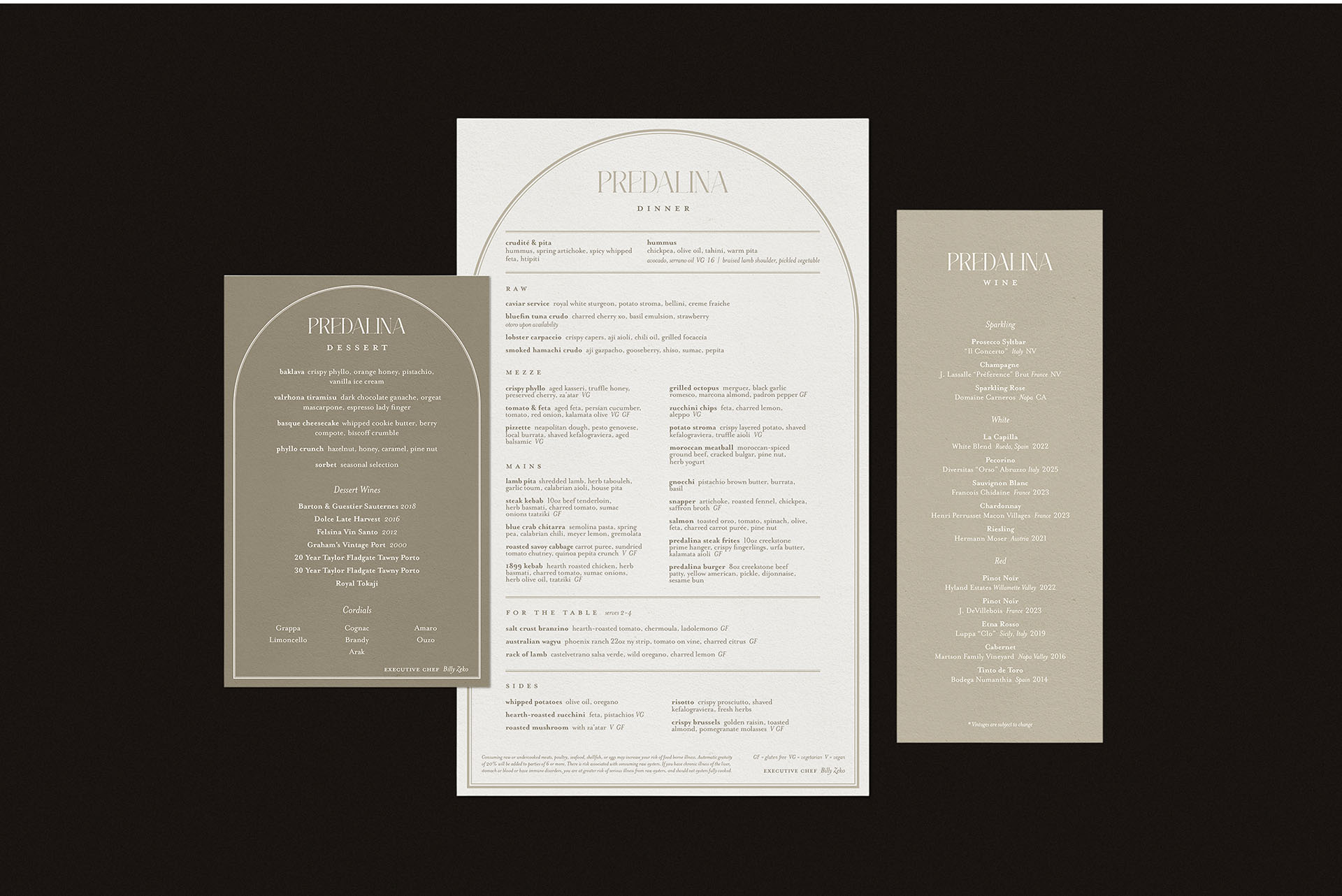
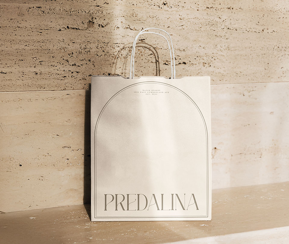
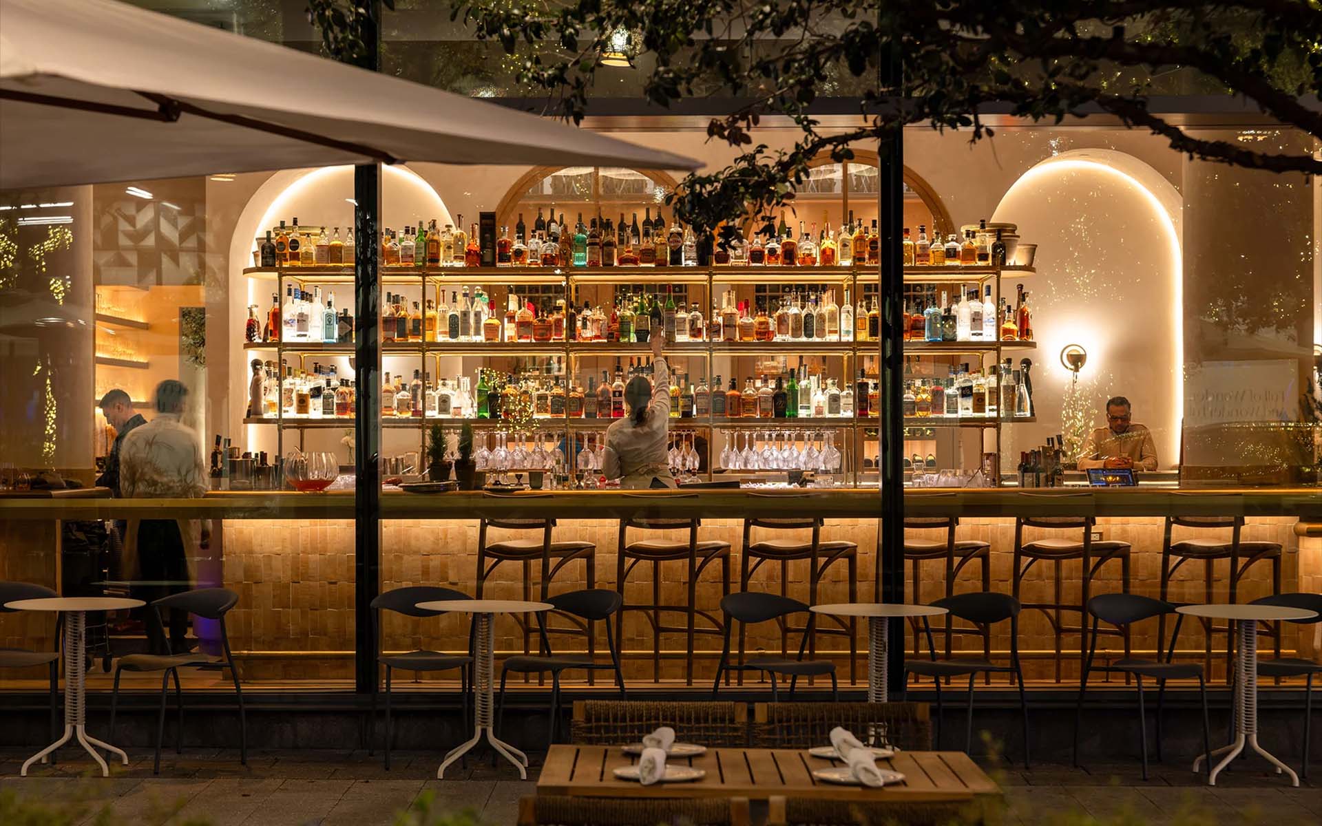
Predalina brings a contemporary approach to Mediterranean dining in Tampa’s Water Street district. Inspired by the natural beauty of the Mediterranean, the color palette combines soft neutrals and green undertones as a nod to the olive trees that grow throughout the region. The primary logo features a classic serif typeface with subtle curves that mirror the arches found in Mediterranean architecture and throughout the restaurant’s design. A secondary mark, a “P” framed within an arch, offers flexibility across print, digital, and packaging applications. Together, these elements create a cohesive system that reflects the restaurant’s refined yet welcoming atmosphere.[...read more]
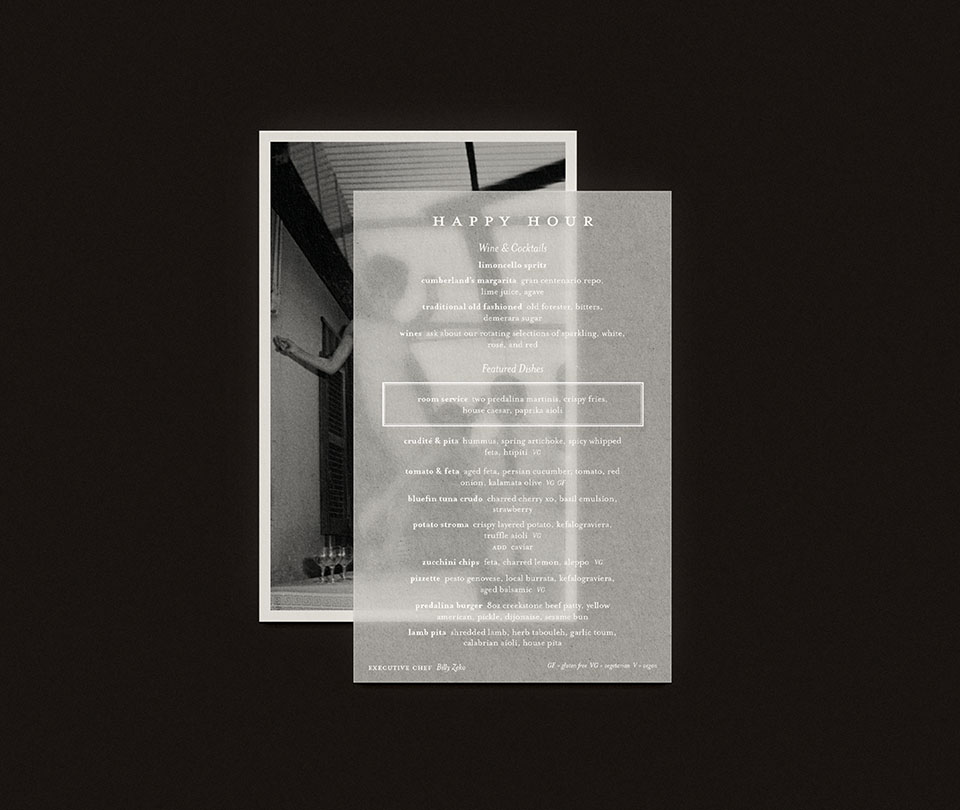
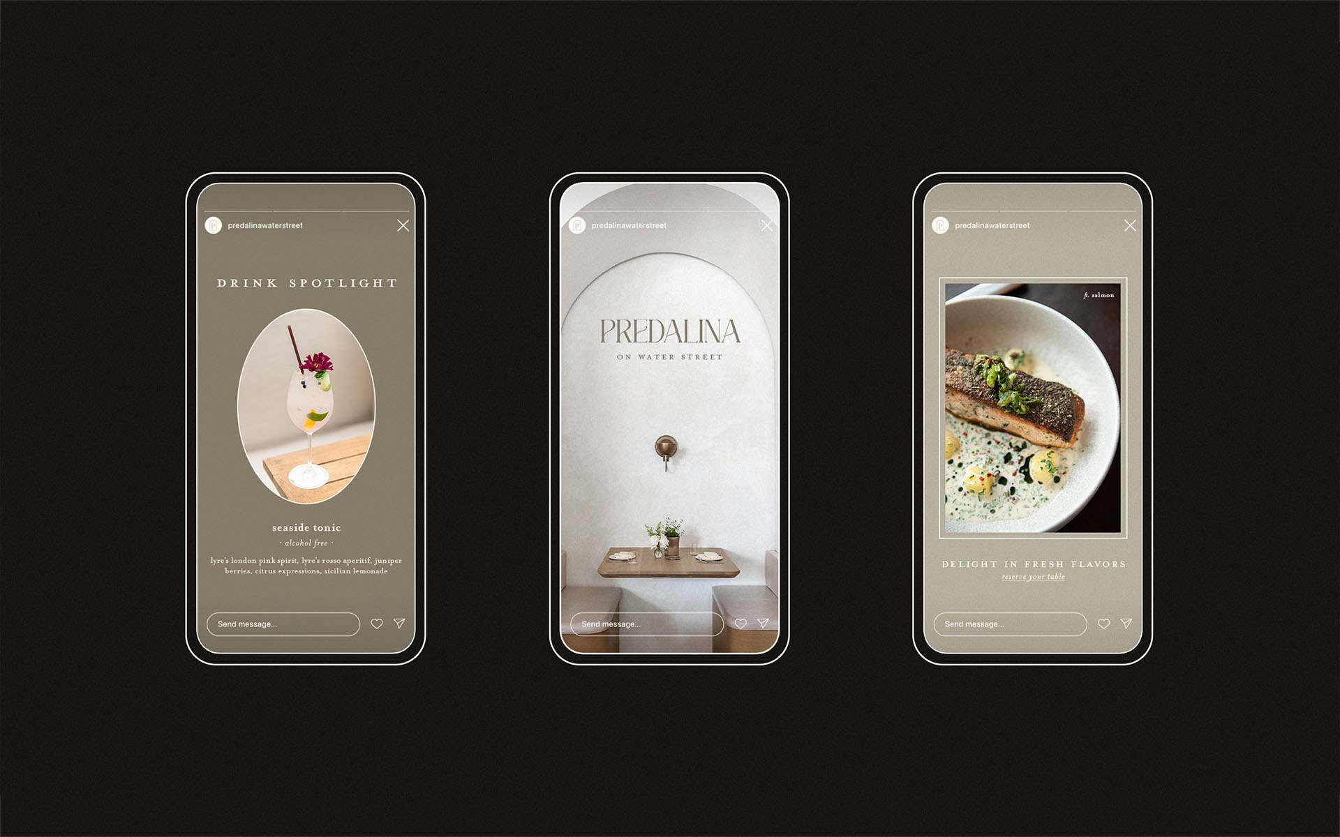
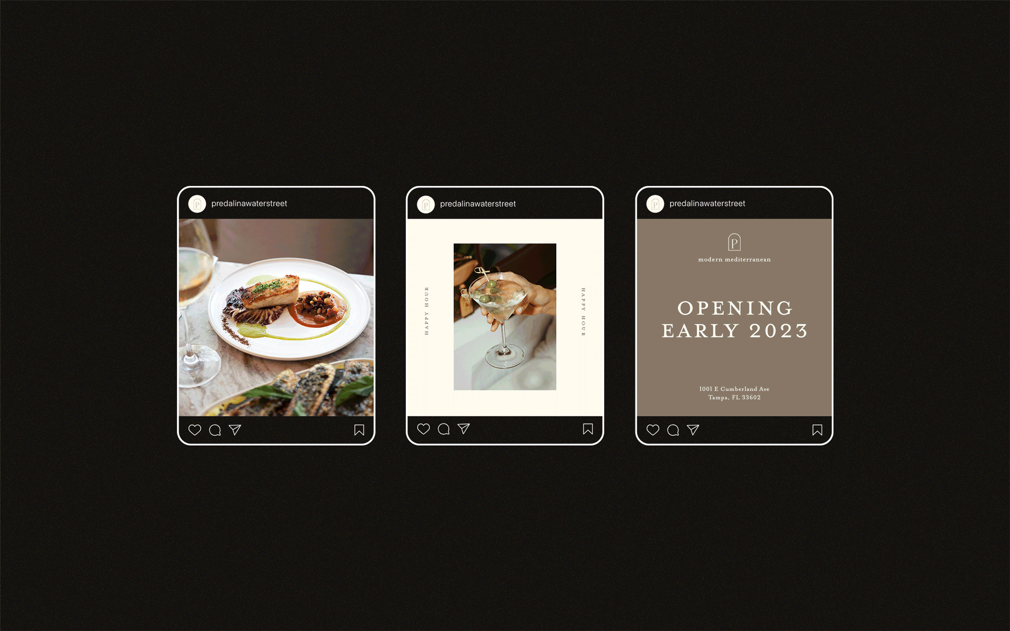
The visual identity came to life across both digital and physical applications, extending into social media, printed materials, and custom packaging. Each piece was designed to build on the brand’s established tone while ensuring consistency throughout the guest experience. Collaboration across teams helped refine every detail so that color, texture, and composition worked together to express the warmth and elegance that define Predalina. The result is a seamless, elevated identity that feels right at home in Tampa’s Water Street district.
The visual identity came to life across both digital and physical applications, extending into social media, printed materials, and custom packaging. Each piece was designed to build on the brand’s established tone while ensuring consistency throughout the guest experience. Collaboration across teams helped refine every detail so that color, texture, and composition worked together to express the warmth and elegance that define Predalina. The result is a seamless, elevated identity that feels right at home in Tampa’s Water Street district.